Usability & Mobile Application I
Aug 30 '18 - Nov 29 '18 (Week 1 - Week 4)
Gilbert Aligoey (0332508)
Usability and Mobile Application I
Exercises
Week 1
29th of Aug '18
First we have to understand UX and UI in order to create a good application.
We also discussed about Usability Principles and Attributes where it is summarized into 4 points proposed by Nielsen (1993), Norman (2002), and Yeh (2010).
Mr. Shamsul started off the class with briefing us the module, told us the stuff that we will do and what can we expect from this module.
- UX/User Experience is basically how the users feel towards a certain product that they are using, and what kind of experience the users get based on what they need.
- UI/User Interface is how the product is laid out for the users based on what they need after they get the feel from the UX.
First we have to understand UX and UI in order to create a good application.
We also discussed about Usability Principles and Attributes where it is summarized into 4 points proposed by Nielsen (1993), Norman (2002), and Yeh (2010).
- Visibility, system provides information that is conducive for communication and interaction, as well as clear instructions.
- Ease, system is easy to learn and familiarize.
- Efficiency, system is easy to use and function at its full capacity.
- Enjoyment, users feel satisfied using the system
30th of Aug '18
Second class, Mr. Razif told us to install PhoneGap both on our PC and Phone.
Basically PhoneGap is an app that helps us to view what we code on our PC to our phone in real time preview.
Mr. Razif then gave a short explanation about different types of languages for coding.
- Native Programming is a kind of programming where for each device, there's a different programming language used. Example for Android: Java, iOS: Objective C, Windows: C/C++
- Web Application uses HTML, CSS, and JavaScript where it can be fitted on the phone but it can't access the phone's function
- Hybrid is a kind of programming where it is a combination of web and native programming using HTML and CSS. It can access the functionality of the phone which is available for both Android and iPhone but not as fast as how native programming language operates.
Mr. Razif then try to help us on the ideas that we can do, what the purpose and the goal of the application is. For example, when creating a music application while helping new artist, we can look from the user's perspective, what if they want to always know that are the latest music release around the user's area, so at the first page of the application theres a button that leads to latest release musics around his area or it can be around the globe, maybe top 50 music, it can be anything.
"So basically, do it for the user.
Know what the user needs and want, then create it for them
That's the main reason on how to get people use your application"
Before ending the class, Mr. Razif showed us how to connect the Dreamweaver and PhonGap.
After that, he gave us an exercise where we have to make some kind of biodata of ourselves using HTML and CSS for the phone view and as a recap for HTML and CSS.
Then I work on this exercise after class. I try to make this looks more towards CV so i can use this later on. I wanted to make it look clean and minimalist as possible because it feels nice to look at and isn't confusing.
So below is my first page.
If you click on the Facebook, Instagram, and Twitter, it will open another page to my social page.
I use this code to make PhoneGap open the link in another page,
Then I work on this exercise after class. I try to make this looks more towards CV so i can use this later on. I wanted to make it look clean and minimalist as possible because it feels nice to look at and isn't confusing.
So below is my first page.
 |
| First Page |
I use this code to make PhoneGap open the link in another page,
"window.open('https://www.facebook.com/gilbert.aligoey?ref=bookmarks', '_system');"
Beside that, if you see on the right bottom corner, there is a circles. That circles is actually an animated circle that i use as a button.
The pulsing effect kind of look like this,
The first page is fine and everything is working out fine. But when i tried to make the second page where it has to open another page, it kind of just refreshed the page.
Week 2
3rd of Sept '18
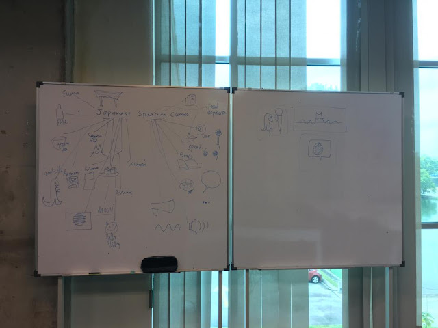
On the second week of class, Mr Shamsul uploaded a short lecture about User Experience Research with an exercise that we did on the class.
My Group was assigned to present about Online Surveys.
Even though it sounds like as it is, actually it has much more into it, and we could learn about how they do it before internet was used to became a platform for surveys to be taken. After all the research is done, then each groups have to present our findings about the topics that were given.
The first group presented about Usability Testing.
Second group,
Third Group,
Fourth Group,
The important and the most asked question is,
What's the number of people should we get sample from and how do we know if information that we got from the surveys is reliable enough ?
Mr. Shamsul then showed us how to know the enough amount of sample we have to get from a number of population, even though it is almost impossible for us to filter out the people that we targeting.
6th of Sept '18
On Mr. Razif Class, he then checked on each of our webpage that we made for the exercise and gave each of us a feedback. He said that I should make the links that I attached to on my Webpage to work and make 2 more pages since I just have 1 page.
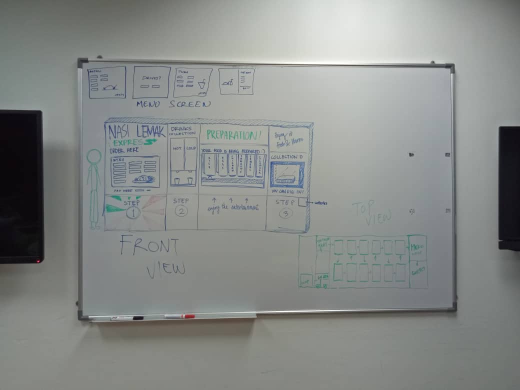
After that we were divided into 4 different groups, we were given a task to make a design of a Nasi Lemak vending machine. (nasi lemak is a malaysia's traditional food which has a rice, nuts, small salty fishes, and sambal), and then told to present after that.
 |
| Group 1 |
 |
| Group 2 |
 |
| Group 3 |
 |
| Group 4 |
After the presentation of each groups, Mr. Razif pushes the other groups to ask any kind of question of how the vending machine works, or the usability, interface and efficiency of it.
The point of this exercise is to make us think not only as the designer, but the customer as well. Maybe how they wanted to just buy it quickly, or how much of a certain side dish they wanted in it, or even a tissue and a trash bin.
Week 3
13th of Sept '18
On this class, we were supposed to get an exercise but since Mr. Razif said that we have to fix our Mobile Application ideas, he consulted us one by one and give some ideas as well.
Below is my idea for the mobile application.
Below is my idea for the mobile application.
Week 4
19th of Sept '18
Feedback was provided on the fourth week, Mr. Shamsul gives some ideas on how we as the students can make the app better and improve it further. Furthermore, He gave us a task where each of us has to find a reference app related to our app, then dissect it. We were told to compare those apps in order to gain some features which the other app does not have and see what are the features that are important to have.
Week 5
26th of Sept '18
Flowchart of our mobile application was the exercise for this week. It has to be made in order to see our app deeper and think further ahead. My mobile application is about Fitness and Health, I was told that I have too many features. Since this project has to be done in 14 weeks time, I have to simplify it to something that is tangible.
Week 6
3rd of Oct '18
An online questionnaire has to be done by this week, those that did not complete the questions were asked to send the questions via e-mail to Mr. Shamsul to get some feedback. My case, however, I was asked "what is the objective of my questions ?" in my questionnaire. I noticed that I'm just pretty much splashing all my questions in the survey without thinking what is the purpose of those questions. Then I went on remaking my questions, putting them in an order, then make it organized.
Week 7
11th of Oct '18
At this week, my questionnaire was finally approved, then I went to send them to my friends. The purpose of my questionnaire is :
- To identify which gender, age, employment status, and etc and how many percentages of those people that prefer exercising at home rather than going to the gym.
- To Identify somethings that they prefer which I can implement later in the app
- To get some pieces of information about anything that I can add on or remove from the app
I received around 28 responses where all of them are usable (fully answered), the responses of the questionnaire can be found here. Besides that, I made a user persona for my mobile app, which has the primary user persona (ideal user), secondary user, and the other (not the main focus of audience of my app).
The flowchart was asked to be submitted too since I did not submit it yet. But the flowchart has been made. The image below is my flowchart.
 |
| The Flowchart |
Week 8
17th of Oct '18
Wireframes of the mobile app have to be finished within this week, and user testing has to be conducted as soon as possible since we are falling behind the schedule. The Adobe XD is used pretty much just to create the prototype version of our App which has only images and the display with only buttons that are functioning. It is used to just show how the app look and feel is like. Below is how my wireframes are looking so far
 |
| Wireframes on Adobe XD |
The user testing was conducted in our juniors' class. I conducted a user testing to one of the students in the junior's class, where I got a feedback that said, It is good and clear. But the problem was some pages did not lead to where it supposed to be. Since my prototype has not finished yet, The only thing that is used was the workout section, which only shows the options of working out, levels of it, animations on how the exercise is done with the timer on it, etc.
High fidelity prototyping progress was started after that. I decided the color palette that I'm gonna use for this app have to be complementary with each other. The following image is my chosen color palette.
The name of the application was quite hard to decide. At first, ManaBeast, ManaBar, and iMana were the names that came to my mind for the app since mana means something like the energy in Polynesian, Melanesian, and Maori beliefs. After many hours on searching words related to body and health, I decided the name to be SoulCase, which means the case of the soul, which is the body.
Below is my logo for the application.
The logo resembles a face, which shows simplicity and clean in design. The face was chosen to be a part of the body as the logo because that is the main features of the body.
As for the Typeface, I chose Roboto because it is simple and basically readable.
After the logo, typeface, and color palette was chosen, I started my progress on designing the high-fidelity prototype right after I refined my low-fidelity wireframes.
High fidelity prototyping progress was started after that. I decided the color palette that I'm gonna use for this app have to be complementary with each other. The following image is my chosen color palette.
 |
| Color Palette |
Below is my logo for the application.
 |
| Logo for The App |
As for the Typeface, I chose Roboto because it is simple and basically readable.
 |
| Roboto Typeface |
 |
| Low Fidelity Wireframes |
 |
| High Fidelity Wireframes |
 |
| Closeup on the high fidelity wireframes |
Week 9
24th of Oct '18
Refining what I have on this wireframes is what I did on this class, I still have some features which I haven't made in the wireframes such as the edit page and show what type of exercises in other people's workouts.
Week 10
1st of Nov '18
Presentation of the prototype was conducted on this class. I got some feedback from both Mr. Razif and Mr. Shamsul where they say my design is still not consistent as one part used real pictures, and the other part used illustrations. Some placement of the content is not good, such as the save button for the custom workout is not well thought. And other placements like the title and content in it.
After that, I refine the prototype to make it better. We were also asked to make more user testing when the prototype has been refined. Below are the user testing that I conducted on my friends.
 |
| User Test 1 |
 |
| User Test 2 |
 |
| User Test 3 |
Turns out after the presentation, since there were still a lot who didn't manage to get their wireframes properly done, Mr. Shamsul and Mr. Razif decided for us to not develop the app this semester so we were asked to further refine our wireframes and do a proper user testing with a proper video and report.
Reflection
In the beginning, I literally have no idea what kind of mobile app that I wanted to do. My mind basically was trapped into thinking what the teachers told us of what we can choose to create which are travel app, fitness app, etc. I chose fitness app not because I don't have other idea, it was because I have some experience in it and I'm quite interested into doing deeper research into it and create an app out of it. But then along the way, I realized that I might have created a mistake since my idea and features that I want to add into the app is too much compared to the time that we have to create it. It was basically not tangible since we have other assignments that we have to do in 14 weeks time. Honestly speaking, I am not happy with what I have created, so I asked to the lecturer if I can change everything again before semester 4 started, but he said it is too late. So the only thing I can do was changing the UI (User Interface). But overall, I learned so much about this area of prototyping and creating the UX for mobile app, and decided that I want to pursue my career in the future as an UX designer.