T&H Week 8 - Week 10 Font Design
25/10/2017 - 8/11/2017 Week 8 - Week 10
Gilbert Evander Aligoey [0332508]
Typography & Hypertextuality
Project 2 : Font Design
Lecture / Tutorials
Week 8
25th of October '17
Mr Vinod and Mr. Shamsul started the class with checking our animation of Mr. Babadook Project and giving us feedback one by one. After giving feedbacks on all of us, he explained about the second project briefly, we have to design our own fonts and digitize it.
Week 9
1st of November '17
On ninth week, our work progress on digitizing fonts were being checked. After that, they also checked our blog about the Project 1, Mr.Babadook. They told me that I have to
add a border for the png image of story book project, add the thumbnails, and take a better picture of the hardcopy book. Then we continued on digitizing.
Week 10
8th of November '17
So, the class started with both of the lecturers checking on our work and giving us feedbacks. Then he gave a lecture about letter spacing and all that we need to know about it.
Fig 1.1 Kerning from here
Kerning is the distance between two letters.
Fig 1.2 Tracking from here
Tracking involves adjusting the spacing throughout the entire word. Tracking can be used to change the spacing equally between every letter at once.
Fig 1.3 Leading from here
Leading is the space between the lines or sometimes called line spacing. If your line length is short, you will need shorter leading and vice versa. A good rule is to keep line length from 35-65 characters, and the ideal would be 45-55.
"We are reading pattern, not the letters"
As you see a sentence or a word, it's actually our eyes recognizing the patterns of the letters, so the more complex a letter is designed, then its even harder for our eyes to read it in a form of a sentence or a paragraph.
Kerning is the distance between two letters.
Tracking involves adjusting the spacing throughout the entire word. Tracking can be used to change the spacing equally between every letter at once.
Leading is the space between the lines or sometimes called line spacing. If your line length is short, you will need shorter leading and vice versa. A good rule is to keep line length from 35-65 characters, and the ideal would be 45-55.
Formatting Text
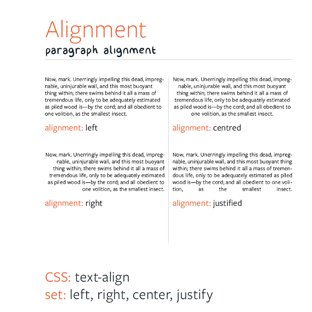
Fig 1.4 Alignment Example
Left Alignment is when a text is arranged on the left.
Right Alignment is when a text is arranged on the right.
Justified Alignment is when a text is aligned on the left margin, and letter and word spacing should be adjusted so that the text falls flush in both margins.
By understading these format, we could present the message clearly, and easier to read for the viewer.
Instructions
Project 2: Font DesignDescription
You will be expected to design a font of 27 western alphabets along with punctuation marks.
To begin with choose an existing font design that adheres to the direction that you would like
to head in. Study the font carefully by analysing its anatomical parts.
Identify a Form (Basic shapes i.e., Square, Circle, Triangle) this shall be the starting point of
your designs. You may also choose shapes that you see around you or that you like (i.e. an
arrow, a face, a building, etc). One of these shapes will form the basis of your font design.
Your font can be designed to also fulfil a specific need.
Start with rough sketches and upon approval begin digitization of the drawings—software for
digitization shall be determined in class. Artworks shall be printed out for critique sessions
followed by refinements. If time permits we shall generate the font for actual use.
Requirements
The student must utilise the accumulated knowledge from the exercises, lectures and from
their own reading (library books and online sources) to guide them and inform them in their
decisions.
The student must document the process (sketches, trial and errors) in their eporfolio and
hardcopy portfolio. The student will be expected to submit the final mock-up in the hardcopy
portfolio and the softcopy PDF (and or JPEG) uploaded or embedded unto the eportfolio.
Create a separate folder in your Google Drive and store all files, artefacts, project
submissions, etc. here.
Ensure all items are logically and chronologically ordered, labelled and dated.
Submission
All gathered information (failures, successes, epiphanies, sketches, visual research, printouts, websites, images, charts, etc.) documented logically and chronologically in the A4 Clear Sheet hardcopy portfolio. The works labelled and dated.
All gathered information (failures, successes, epiphanies, sketches, visual research, printouts, websites, images, charts, etc.) documented logically and chronologically in the eportfolio for the duration of the project in one post.
Images of all the designed alphabets or glyphs on one A3 printed and uploaded.
All the glyphs transferred to the determined software, formatted for the purpose of generation.
Objectives
To develop students ability to construct a readable and legible font.
To develop students ability to design a font with consistent characteristics.
To allow students to experience the various phases of font design.
Work Process
The first step was to figure out what type of font that I wanted to make, so I looked it online and trying to find something simple. And i see that I like Arial and Futura type of font. So i decided to make something similar to both of those.
 |
| Arial Font |
 |
| Futura Font |
 |
| The Drawn out Letterforms |
 |
| The digitized letterforms. I kept the construction shapes and lines so that I could make adjustments later following feedback |
I then set up a 500 by 500 points document with 96 artboards, My x-height is 500 points with 113 points as the ascender, and 152 points for the descender.
After some feedbacks and revision of my letters, I then finally can begin to move all the letters into FontLab Studio, we also have to set the font info as the settings that we have in illustrator. After moving all the glyphs individually to FontLab, I have to edit the letter spacing and kerning on my font.
 |
| All the glyphs transferred to FontLab |
Final Submission
 |
All The Finished Letterforms |
 | |
| Font design submission, preview of the OTF/TTF is open in windows. |
Feedback
Project 2 : Font Design
- Week 9
General Feedback : Before moving the fonts to fontlab from illustrator, we have to fix the letters first and it should only be one shape. After that we have to print it out on A4 for our hardcopy portfolio.
Specific Feedback : My fonts size are passed the x height which is 500 x 500 pt. So i have to remake everything again.
Specific Feedback : My fonts size are passed the x height which is 500 x 500 pt. So i have to remake everything again.
- Week 10
General Feedback : Kerning and Letterspacing are two different things and we need to learn that in order to create a font. Next week we have to print the final fonts from illustrator.
Specific Feedback :
After Mr. Shamsul and Mr. Vinod checked my work, and said that my curves are not consistent with my style, other parts have to have like a straight horizontal or vertical line.
i have to change the curves on my numbers and symbols aswell. Positive symbol needs to be bigger and matches the others. other than that is quite consistent and good
- Week 11
General Feedback : We are supposed to submit the project today or it would be considered late.
Specific Feedback : When the lecturer checked my blog, he told me to make the reflection part longer as it's one of the important part of the blog, for the poster design, he said that my first design isn't good, where my design have to show the characteristic of my font. But after quite a while, I think he sees that I haven't got any idea on how to design a good poster, so he gave me some.Reflection
Project 2: Font Design (Week 9- Week 10) reflection- Experience
I was full of ideas on how im going to design my font, but then I was quite struggling on how to make the digitized fonts look exactly like the letters that I sketched, but still the satisfaction of seeing the font that I created being typed out with every tap on keyboard is quite addictive
- Observation
During the research, I was kinda looking for the elegant, simple, symmetric kind of fonts maybe because i like how display fonts looks and easy readability of it. I noticed that everytime i think that my work is perfect, Mr. Vinod will always finds imperfection in it, so I have to keep on practicing and be more observing on details and stuff.
- Findings
This have been an amazing experience, I usually don't really care that much about fonts and typeletter before, i just see them as, well just letters as symbols that we could read and use to communicate.
The research about fonts and how it evolves through times is quite amazing. I learned a lot about how difficult it was to just create a letterforms, adjusting and tweaking them to try to meet modern day conventions has also thought me a lot about how design standards for fonts have changed the past 70 years or so.
I actually feel grateful to know this because it might be one of my advantages in the future career.
Further Reading
Week 9
Publication Design - Poppy Evans
by Ambrose / Harris


