Web Design and New Media Exercises
28th of Mar '18 - 4th of Apr '18 (Week 1 - Week 2)
Gilbert Evander Aligoey (0332508)
Web Design and New Media
Project 1
I typed all the contents in HTML first then I stylized them in CSS
Gilbert Evander Aligoey (0332508)
Web Design and New Media
Project 1
Lecture Notes
Week 1
27th of March 2018
Mr. Shamsul started off the class by explained the module outline briefly for this module, he told us that there will be two projects and one final project, and some exercises throughout this module. Mr. Shamsul also told us to read books and articles about HTML 5, CSS, User Interface, and Usability. Those will be the things that we do research about.
He then begin to explained to us about websites. There are good and bad websites, we should be able to critically analyze and identify all the sections of the websites (layouts, typace, color schemes, navigation, usability, accesibility, consistency, etc).
There are 2 types of website;
1. Static Website : basic website that's easy to create using HTML, where the any users entering the site will receive the same information. If we were to update the content, it will have to be done manually.
2. Dynamic Website : website where its content changes according to the users who access it. It accesses content from CMS (Content Management System) where if the content of the database updated, the content of the website will also update by itself.
and we also learned about two sides in the term of websites which is;
1. Server Side : where the programming is run on the web server
2. Client Side : where the programming is run on the web browser/users
Complementation is when colors are seen in terms of their relationship with other colors such as the triadic and compound color schemes, etc.
Contrast is when it reduces user's eye from straining too much and it focuses user's attention by dividing elements on the page.
Mr. Shamsul also told us that the three commonly accepted structure for a good color scheme are triadic, compound, and analogous.
Mental Models is the pre-expectation for the users.
When organizing the navigation of a website, it is best to not use too confusing and bombastic words that will confuse the users.
Then Mr. Shamsul explained that there are two types of wireframes, which are;
Low fidelity wireframe, which is what we did for the exercise, by drawing only boxes.
High fidelity wireframe, which is what we did for our Project 1 where there's colors, typefaces, and graphics.
9th of May 2018
On the eighth week, Mr. Shamsul gave us a lecture on box model.
By default, HTML width is 100% where it fills up the entire screen. To control the size of the screen, one can use either pixels, percentage, or em. Pixels will allow users to accurately control the size of the screen while percentage is more relative to the size of the browser. For us to also limit the width, we can use min-width and max-width. We can also choose to hide certain content or even set a scrollbar by using overflow property.
Then Mr. Shamsul explained about border, margin, and padding.
On the ninth week, Mr. Shamsul gave us a lecture on responsive website, before he asked us to do a research about viewport and @media.
Week 2
4th of April 2018
For the second lecture Mr Shamsul explained about Colors.
There are two websites that can help us find a color scheme if we are not comfortable using swatches, which is color.adobe.com and paletton.com.
Contrast is when it reduces user's eye from straining too much and it focuses user's attention by dividing elements on the page.
Mr. Shamsul also told us that the three commonly accepted structure for a good color scheme are triadic, compound, and analogous.
 |
| Fig 1. Color Structure |
Week 3
11th of April 2018
On the third week, Mr. Shamsul gave us a lecture on Web Standarts.
Web standarts are there because of hardware and software issues such as the variety of browsers, operating systems, screen resolutions, etc.
How an user access the web may differ from other users depending on what browser, operating system, screen resolution, etc. Therefore the World Wide Web Consortium (W3C) is made to create and manage the web standarts.
The W3C defined one of the standarts which is the Standart Markup Language for creating a web. The SML that is often used are HTML, CSS, Javascript, etc.
After that Mr. Shamsul just started explaining about the structure of web pages as well as coding and the basic informations about HTML and CSS.
Week 4
18-19th of April 2018
On this week, Mr. Samsul started the class with a lecture about orginizing a website.
The first step is a concept called chunking, diving the information in the website into a manageable chunks of content. Every site has an information architecture, where it describes the overall conceptual models and general designs used to plan, structure, and assemble a site. When confronted with a new and complex information system, users build mental models.
When organizing the navigation of a website, it is best to not use too confusing and bombastic words that will confuse the users.
Then Mr. Shamsul explained that there are two types of wireframes, which are;
Low fidelity wireframe, which is what we did for the exercise, by drawing only boxes.
High fidelity wireframe, which is what we did for our Project 1 where there's colors, typefaces, and graphics.
Week 5
25th of April 2018
No class was conducted on this week.
Week 6
3rd of May 2018
This week Mr. Shamul pretty much just explaining what is the difference between HTML 4 and HTML 5, so the difference are;
1. Consistency in Handling Malformed Documents
The primary one is consistent, defined error handling. As you know, HTML purposely supports 'tag soup', or the ability to write malformed code and have it corrected into a valid document. The problem is that the rules for doing this aren't written down anywhere. When a new browser vendor wants to enter the market, they just have to test malformed documents in various browsers (especially IE) and reverse-engineer their error handling. If they don't, then many pages won't display correctly (estimates place roughly 90% of pages on the net as being at least somewhat malformed).
So, HTML5 is attempting to discover and codify this error handling, so that browser developers can all standardize and greatly reduce the time and money required to display things consistently. As well, long in the future after HTML has died as a document format, historians may still want to read our documents, and having a completely defined parsing algorithm will greatly aid this.
2. Better Web Application Features
The secondary goal of HTML5 is to develop the ability of the browser to be an application platform, via HTML, CSS, and Javascript. Many elements have been added directly to the language that are currently (in HTML4) Flash or JS-based hacks, such as
<canvas>, <video>, and <audio>. Useful things such as Local Storage (a js-accessible browser-built-in key-value database, for storing information beyond what cookies can hold), new input types such as date for which the browser can expose easy user interface (so that we don't have to use our js-based calendar date-pickers), and browser-supported form validation will make developing web applications much simpler for the developers, and make them much faster for the users (since many things will be supported natively, rather than hacked in via javascript).
3. Improved Element Semantics
There are many other smaller efforts taking place in HTML5, such as better-defined semantic roles for existing elements (
<strong> and <em> now actually mean something different, and even <b> and <i> have vague semantics that should work well when parsing legacy documents) and adding new elements with useful semantics - <article>, <section>, <header>, <aside>, and <nav> should replace the majority of <div>s used on a web page, making your pages a bit more semantic, but more importantly, easier to read. No more painful scanning to see just what that random </div> is closing - instead you'll have an obvious </header>, or </article>, making the structure of your document much more intuitive.
Week 7
No class was conducted on this week.
Week 8
16th of May 2018
By default, HTML width is 100% where it fills up the entire screen. To control the size of the screen, one can use either pixels, percentage, or em. Pixels will allow users to accurately control the size of the screen while percentage is more relative to the size of the browser. For us to also limit the width, we can use min-width and max-width. We can also choose to hide certain content or even set a scrollbar by using overflow property.
Then Mr. Shamsul explained about border, margin, and padding.
- Border separates the edge of one box to another.
- Margin creates a gap between the border of two boxes.
- Padding is the space between content and the border of the box.
Week 9
24th of May 2018
- Viewport is the user's visible area of a web page.
- @media is a rule in CSS to include a block of CSS properties only if a certain condition is true.
Exercise
Exercise 1
28th of March 2018
Instructions:
Identify 6 good and bad websites from webbyawards.com and thebestdesigns.com. Then fill up the google sheet that was shared.
After we've done it, we send the file to the lecturer.
The websites that is considered as "good" website are those that is easy to navigate, clear purpose, good choice of color scheme, consistent layout, attractive but not distracting, etc. and there's bad websites, which is just the opposite of the points above.
The websites that is considered as "good" website are those that is easy to navigate, clear purpose, good choice of color scheme, consistent layout, attractive but not distracting, etc. and there's bad websites, which is just the opposite of the points above.
Exercise 2
5th of April 2018
For exercise on week 2, we were asked to answer some questions online.
 |
| Fig 2a. Questions from Lecture Slide |
and here's the answer that i found based on the research.
 |
| Fig 2b. Answers to exercise questions |
Exercise 3
12th of April 2018
The third exercise is that we have to do a simple form of HTML after the lecture. We were asked to write a paragraph about ourselves, a list of our hobbies, favorite movies, and the places that we wanted to go. it's like an introduction to coding a website so it's easier for us to understand it.
Exercise 4
19th of April 2018
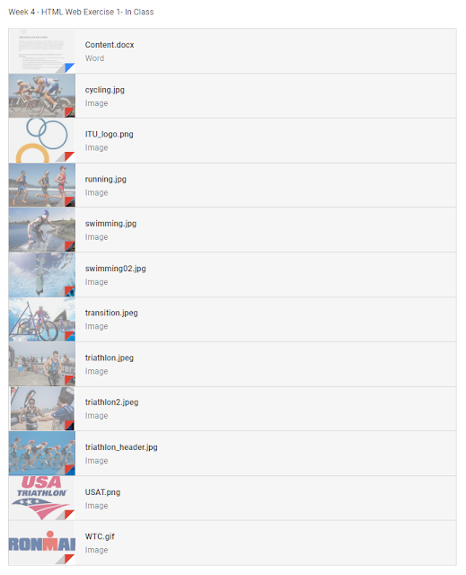
We were asked to start coding in Adobe Dreamweaver. Mr. Shamsul uploaded all the stuff that we need to make the web. We basically just need to make all the stuff and materials comes together with coding.
 |
| Fig 3.a. Materials for the exercise |
 |
| Fig 3.b. Web View |
 |
| Fig 3.c. Web View |
Exercise 5
4th of April 2018
This week we are just getting started into CSS, we were told to try and insert the CSS to the exrcise that we did last week.
Exercise 6
9th of May2018
There was no class on this week, so we were given an exercise online through Google Classroom. We were given a task to recreate a similar content to what Mr. Shamsul uploaded, and we are required to use CSS rules for this exercise.
I typed all the contents in HTML first then I stylized them in CSS
 |
| Fig 4.a. HTML Codes |
 |
| Fig 4.b. HTML Codes |
 |
| Fig 4.c. CSS Codes |
 |
| Fig 4.d. Final Outcome |
Exercise 7
16th of May2018
The exercise that are given is to prepare us for our second project. We were given a task to try and create a simple layout for a webpage.
We have to make blocks for the content that will later be putted in using css, make the navigation bar and fill a background with a custom image and stuff.
 |
| Fig 5.a. Codes in CSS |
 |
| Fig 5.b. Final Outcome |
Exercise 8
23rd of May2018
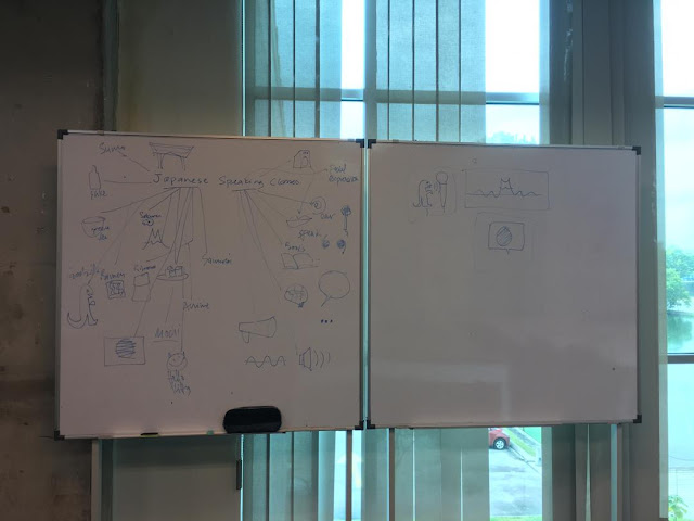
For this exercise, we have to make a web, as similar as possible with a wireframe that Mr. Shamsul drew on the board. He gave us the materials such as the logo and the image background that will later be used in there.
 |
| Fig 6.a. Final outcome |
But for this one, he wanted it to be responsive, which means it can be accessed through different viewports (smaller/bigger screens). So we have to use @media
 |
| Fig 6.b. Final outcome on smaller screen |