Usability & Mobile Application II
1st April - 5th July 2019 (Week 1 - 14)
Gilbert Evander Aligoey (0332508)
Usability and Mobile Application II
As for the second class, we did user testing of our app on our juniors. In pairs, we picked two juniors to do this testing while having our partner to record this activity.
As for the color scheme, I decided to go for colors that are "fresh", "energetic", and "free".

Gilbert Evander Aligoey (0332508)
Usability and Mobile Application II
Mobile Application Proposal
The UI(User Interface) that I've made on semester 3 for Usability & Mobile Application I class has been revised over and over again during the semester break. I changed it because I was not satisfied with it at all and I knew that because of the time that was given on Usability & Mobile Application I was not enough, therefore I can't put my everything into the project. Hence, I decided to do it during the break to make sure I have enough time to work on it.
-----
Week 1
The class started off with the module outline explained briefly to the whole class and informed us about what is expected from this module. After that, each of us got consulted for the previous project that we did on Usability and Mobile Application I to get feedbacks from Mr. Kannan and Razif regarding a few suggestions and things to consider.
I was given feedback on what makes my app different from what has existed, what are the features that might still be added into, and how the marketing strategy should be implemented.
Week 2 & 3
No class conducted due to collaboration with RMIT University.
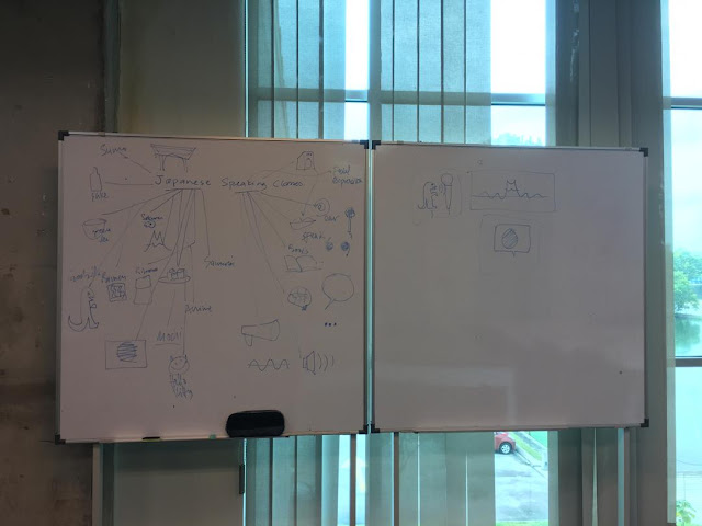
Week 4
We were given another task to redo our mobile app proposal, to give us a clearer idea of what is our app about. Below is the image of my app proposal.As for the second class, we did user testing of our app on our juniors. In pairs, we picked two juniors to do this testing while having our partner to record this activity.
 |
| User Testing 1 |
 |
| User Testing 2 |
The point of this activity is to get some feedback regarding this app. Finding what things and features should be added or is there something that makes the user confused and hard to understand the usability of the app itself.
Below are the data collected from the testing.
 |
| User Test 1 Data |
 |
| User Test 2 Data |
From the data gathered, I can refine my application and design it to the way where everyone is able to recognize the logo and symbols used in the interface and make it less confusing.
Below are the comparisons of the interface that I did before and after revision.
 |
| Logo |
 |
Login Page |
 |
Main Page |
 |
Main Page (2) |
 |
Reminder (Timer) |
 |
Create a Custom Workout Page |
 |
Explore Page |
 |
Profile Page |

I used a lot of references for the colors while playing with the colors to get the right match. I also found that these colors are not used that often in applications. I feel that by adding these kinds of colors will make the application more vibrant and attractive while pleasing to the eye.
Links
Week 5
After showing the revision of my app to Mr. Kannan, he told me that it is ready to move onto the next step which is coding. But it would be nice if I add features such as food program (Diet), Personal Trainer, Calories and Workout result information after working out, and add more of the visual element in the other pages, not just the main pages.
On the next consultation, after some discussion, he agreed to me that maybe it's best to not add the food program since it is going to be too much. For the personal trainer, it is not necessary since the workout plan is already set out in the workout choices.
As for the workout result information, I have added it into the features just like in the image below.
 |
| Workout result information page |
Week 6
The UI of my application is ready to go to the coding part, said by Mr. Kannan. He said that this is already good to go.
On the class with Mr. Razif, we will be focusing on the coding section where we will cover HTML5, CSS, jQuery, and possibly Javascript as well.
We will be using Adobe Dreamweaver to code our application, while connecting to the PhoneGap server which we have it installed on our phones too, in order to see how the application looks like directly onto our mobile phones. By doing this, we can try and fix it at the spot if anything doesn't go as we'd like it to.
Week 7-8
On this week, Mr. Razif gave us an exercise on which we have to use jQuery Mobile in HTML to create two pages which have a button on each page that could direct us into one another.
Once we are used to using jQuery Mobile, we then focus on our mobile application to make the prototype of it using HTML and jQuery Mobile.
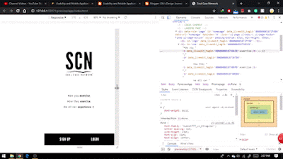
Below is the finalized version of my mobile app (Adobe XD File).
https://drive.google.com/open?id=1RQFEX5ECYLJ8F3dQ6ALCpdMePBGVqxGJ
Once we are used to using jQuery Mobile, we then focus on our mobile application to make the prototype of it using HTML and jQuery Mobile.
Below is the finalized version of my mobile app (Adobe XD File).
https://drive.google.com/open?id=1RQFEX5ECYLJ8F3dQ6ALCpdMePBGVqxGJ
Week 9-14
On this week, I started to code my prototype on Dreamweaver. I always try to make the layouts all responsive, for instance, if the login button is in the middle bottom of the screen, then on other devices like Ipad or iPhone 6, it has to be in the middle bottom as well.
On making the Front-End Development on Dreamweaver, I planned to finish the layouts first then move onto the animation since I have yet to figure out how to animate things with javascript. Further down the road, I found myself struggling to make the codes work. Somehow if I run the index which contains the animation, everything works as it should be, but if I open it through the first index page that leads into the index page that contains the animation, it doesn't work. Later I found out that it has to be run externally, meaning basically rebooting/starting the index itself independently. There are some pages that don't have animations, especially on the main page since it is the main attraction for animation, I tried to do it but I just found myself stuck and wasted a lot of hours figuring it and still doesn't work as it should be. But anyway, I got the animations working on other pages. This coding section is pretty rushed for me considering other subjects are demanding fina submission as well, so I can't really put 100% of my effort into this. But overall, I managed to finish it within the timeframe given.

| Responsive Layout Design |
Below is the video walkthrough of my prototype.
| Protoype Video Walkthrough |